To Tuck Into a Stocking: A Portal to Dreams of NYC
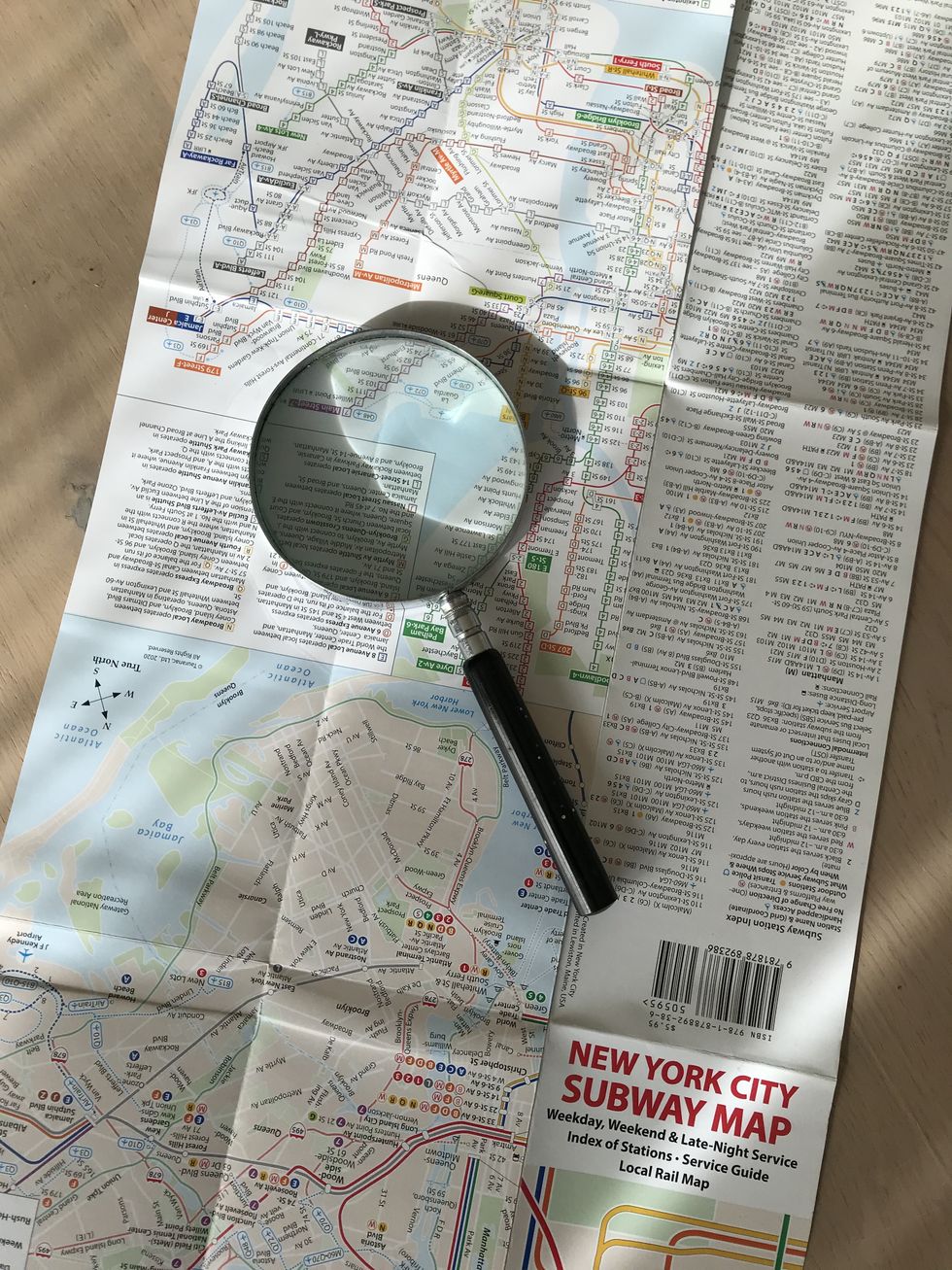
John Tauranac, designer of the iconic New York City subway map, has a new and improved map that he is selling at retail outlets, including the Wish House in West Cornwall. Photo by Cynthia Hochswender
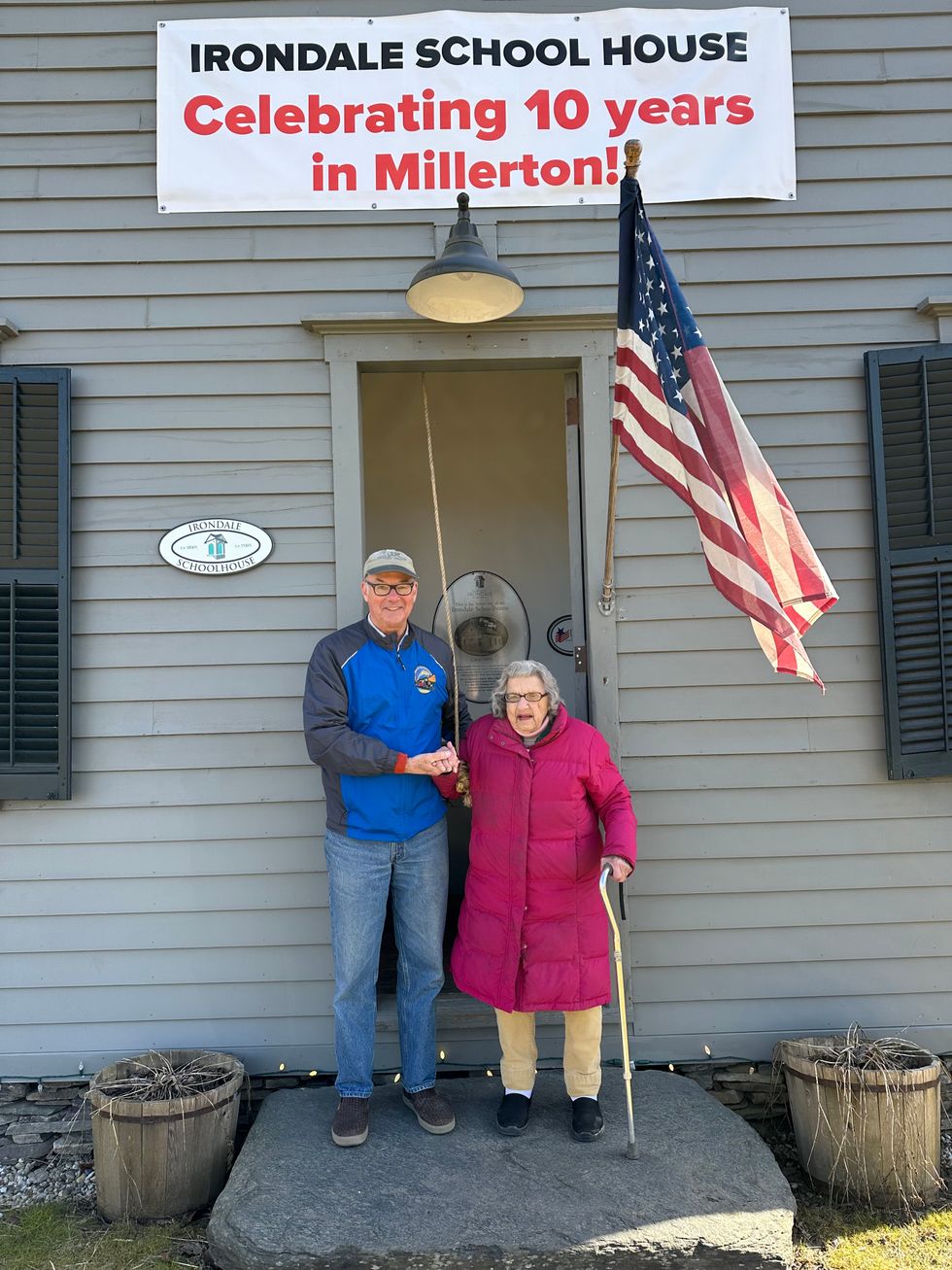
To Tuck Into a Stocking: A Portal to Dreams of NYC

Mapmaker John Tauranac (a part-time resident of Cornwall, Conn.) has taken the iconic New York City subway map (which he designed) and made it, if possible, even a little better. 

This new version, published in August, is published by Tauranac Maps and can be purchased locally at The Wish House in West Cornwall, Conn. (www.wishhouse.com) for $5.95. 

When Tauranac, a Cornwall, Conn., resident and a fairly low key gent, was asked if it lives up to its billing as “ultimate subway map,” he modestly confessed, “I am so vain as to believe that it is.” 

The very first New York subway map was produced in 1904 as an advertising postcard issued by Wanamaker’s Department Store in Manhattan, which could be accessed by a subway station stop on its lower level.

Many map iterations followed, but it was the 1979 version that introduced the concept of color coding the subway lines. 

Tauranac was already achieving acclaim for his 1972 and 1973 “undercover maps” of Midtown and Lower Manhattan, tracing the underground walking passages that thread through and under the city’s buildings. 

He was employed by the MTA (Metropolitan Transit Authority) and in 1974 was working on creating an official travel guide and introducing a geographically accurate subway map.  

By 1978, he was the chairman of the MTA subway map committee but had been unsuccessful in gaining approval for his ideas for the color-coding system. 

That same year, though, bolstered by the support of socialite and powerhouse Phyllis Cerf Wagner, Tauranac’s concept of the quasi-geographic, color-coded system was approved by the MTA president.

The 1979 MTA map has provided the bones for all subsequent maps, Tauranac said. But with each new edition, the map has incorporated changes that render it more confusing.

Tauranac’s new MTA pocket map pack is self-published and conveys even more information in a clearer, color-coded and keyed presentation. For example,there is now a separate map on the reverse side with information about late-night service. 

For any riders who have ever discovered that they were traveling north on a line when they meant to go south, Tauranac has added a no u-turn symbol to indicate stations where riders cannot cross the tracks without paying to go the other way. If you don’t see the symbol, you can use that station to correct your directional error.

The new map also answers the question of where the subway station is in relation to a station stop, particularly helpful when avenues are positioned diagonally to the normal street grid. To promote clarity, Tauranac explains that exercising geographic license makes the map “quasi-geographic.”

With the aid of a key guide printed at the top of the map, riders can tell a lot about a station by the color, its intensity and the geometric shape representing the subway line.  

Access for handicapped riders is noted with a visual cue — although Tauranac notes that ease-of-access information is also helpful for riders with luggage or baby strollers. 

For the first time, there is an index of stations within the subway system, with bus connections noted for each station, for example.

As for where the lifelong interest in the details of New York City transit and architecture began, Tauranac credits his childhood years when his father, who was the manager of a major hotel, took him on regular city walks in the 1960s. 

Tauranac’s mother had died when he was very young, so these walks with his father were especially important. His father would often pause to point out who lived where along Fifth Avenue, for example.  

“It sort of stuck,” Tauranac said.

To put together a more substantial gift of New York City lore, there are additional Tauranac works that offer a deep look into the city and what lies beneath its surface, including a poster version of the new map.

Although all authors love all their books, as parents love their children, Tauranac was especially pleased with a review of one of his books, from the New York Times. About “Manhattan Block By Block: A Street Atlas,” the paper said, it “offers just about all the critical information a site-seeker might need — and then some.’”

Sometimes more is more. 


To find out about John Tauranac’s books and insights into New York City, go to his website at www.johntauranac.com.

Related Articles Around the Web

Latest News

At Amenia’s newest restaurant, 'food is the absolute standout'

Panacea’s Rockaway oysters on the half-shell are procured daily and served fresh. Accompanying the oysters is a classic bowl of vinegar and a house-made raspberry mignonette.

Madeline Park

Arriving at Panacea feels like arriving at a friend’s house. A charming blue exterior, with a large patio and string lights, surrounds a welcoming and warm interior. Since the restaurant opened a little over two weeks ago, I have made not one, but three trips, and every time has been just as enjoyable as the first.

Upon entering, one is greeted by a host’s stand in a small front dining room, as well as a handful of tables and a little bar tucked into the corner. Moving back through a small hallway, hosting two gender non-specific bathrooms, there is another dining room, larger but still just as cozy. The entire place is made up of dark, caramel colored wood, with beams stretched across a white ceiling, a fireplace tucked in the back dining room and eclectic artwork smattered around. From the back dining room diners enjoy a glimpse into the kitchen, clean and busy, and an enclave where one can see the finishing touches being put on dishes before being whisked away. All of these parts, clearly lovingly curated by Jake Somers and his fiancee/co-chef Khendum Namgyal (who is responsible for the absolutely unmatched pasta), come together into a very pleasant whole.

Keep ReadingShow less
Unwinding with wine at Spring Hill

Bottle of Spring Hill cabernet franc with watercolor label art by Barcelona native Santi Moix.

Sava Marinkovic

Wine finds its perfect pairing in art at Spring Hill Vineyards in New Preston, Conn., where site-specific sculptural installations function as the visual feast to complement a focused lineup of thoughtfully crafted wines.

Guided by an ethos for quality over quantity, four wines—a light, bright estate-grown cabernet franc, sippable unoaked chardonnay, lean and refreshing Cayuga white, and a sweet rose of pinot noir—make up Spring Hill’s current wine list.

Keep ReadingShow less
Integrating art with science at Cary Institute

Attendees mingle at the opening exhibit at Cary Institute of Ecosystem Studies in Millbrook, N.Y. on Friday, Aug. 16.

Photo by Natalia Zukerman

The Cary Institute of Ecosystem Studies in Millbrook, renowned for its cutting-edge environmental research, recently unveiled a new art installation, showcasing the vibrant synergy between art and science. On Friday, Aug. 16, a small group of invited guests that included patrons, donors, trustees, board members, and other friends of the institute, were led through a private tour of the exhibition by Cary Institute President Joshua Ginsberg. The exhibition features work from staff, programs run off-site through the institute, and the work of artists from the Canoo Hills Creative Arts Residency, a program that has nurtured creative expression at the intersection of art and ecological science since its inception in 2009.

The residency program has hosted 11 artists over the years, but was paused during the COVID-19 pandemic as the institute underwent significant renovations. The building was originally designed by Malcolm Wells, regarded as the father of modern earth-sheltered architecture. The renovations led by Bruce Becker, an expert in energy efficiency and historic restoration, incorporate principles from LEED and the Living Building Challenge, achieving Zero Carbon, Zero Energy, and Core Green standards. The building now boasts an Energy Use Intensity Rating of 61 kBtu/ft², making it 48% more energy efficient than a typical office building. In other words, the building itself is a work of art and has restored Wells’ original vision of creating a near-zero energy building. It is a perfect complement to the art it now houses.

Keep ReadingShow less